What We Can Learn From EUR/USD's Recent Price ActionEUR/USD has been trending steadily higher over the past month, but the most useful lessons aren't necessarily found in the direction of the move itself. The way those gains have developed tells us considerably more about how momentum behaves once a trend becomes established.
Looking at the four-hour chart, three features stand out: the relationship between impulse and consolidation, the behaviour of pullbacks around Anchored VWAP and the structure the market has created along the way. Each offers a practical lesson that can be applied well beyond EUR/USD.
Impulse and Consolidation
One of the clearest features of EUR/USD's uptrend is that relatively little of the time has actually been spent moving sharply higher. Most of the gains have arrived through short bursts of momentum, separated by much longer periods of consolidation.
The late-July breakout provides the first example. A sharp impulse carried EUR/USD higher before price spent much of the following two weeks moving sideways. Another burst of momentum followed in mid-August, followed by a tighter pause, before the next impulse carried the pair higher.
EUR/USD Four-Hour Candle Chart
Past performance is not a reliable indicator of future results
There is a useful trading lesson here. By the time an impulse is obvious, a meaningful part of the move may already have taken place. The quieter periods between those moves can therefore be just as important, providing an opportunity to assess how the market structure is developing before momentum returns.
That doesn't mean every consolidation should be traded as a continuation pattern. Some will fail. The point is that momentum frequently develops in bursts, and recognising that rhythm can help avoid the temptation to chase price precisely when it is moving fastest.
Reading the Pullbacks
Pullbacks have been relatively shallow throughout the advance, but their location has also been revealing.
Anchoring VWAP around the area immediately preceding the late-July breakout gives us a measure of the volume-weighted average price since the move began. On two subsequent occasions, EUR/USD pulled back towards the rising Anchored VWAP before buyers regained control.
EUR/USD Four-Hour Candle Chart
Past performance is not a reliable indicator of future results
The important observation isn't simply that price touched VWAP and bounced. It is that attempts to retrace the advance repeatedly found demand around an average price that was itself continuing to rise.
This provides another way of assessing the quality of a trend. As long as pullbacks remain relatively contained and buyers continue to respond around meaningful reference points, there is little evidence that the underlying structure has materially deteriorated.
Anchored VWAP shouldn't be treated as mechanical support, however. Its value comes from the reaction around it rather than the line itself.
Structure Matters Most
Perhaps the most useful information left behind by the rally comes from the periods when EUR/USD wasn't trending strongly at all.
Each consolidation has created horizontal structure beneath the market. As the trend has progressed, those areas have formed at progressively higher prices, giving traders a series of reference points against which future pullbacks can be judged.
EUR/USD Four-Hour Candle Chart
Past performance is not a reliable indicator of future results
This becomes particularly relevant now that EUR/USD has pulled back towards its rising trendline. The trendline helps visualise the direction and rate of the advance, but its precise positioning is subjective. The horizontal levels created by previous areas of consolidation provide a less subjective record of where buyers and sellers have previously competed for control.
A break of the trendline alone would therefore provide limited evidence that the broader trend has changed. Greater significance would come from price beginning to lose the horizontal structure created during the advance, particularly if a former support area subsequently starts acting as resistance.
This also provides a useful way of separating a routine pullback from a genuine change in character. Rather than trying to decide whether every red candle marks the top of the move, traders can monitor how much of the structure supporting the trend is actually being surrendered.
Putting It Together
EUR/USD's recent advance highlights three different ways of reading the same trend. The impulse-and-consolidation sequence tells us something about how momentum is being delivered, Anchored VWAP provides context around the pullbacks, and the structure created during those consolidations gives us reference points for judging whether the trend remains intact.
None needs to be used as a standalone signal. Together, however, they provide a much better picture than simply drawing a trendline and assuming the trend remains bullish until that line breaks.
Disclaimer: This is for information and learning purposes only. The information provided does not constitute investment advice nor take into account the individual financial circumstances or objectives of any investor. Any information that may be provided relating to past performance is not a reliable indicator of future results or performance. Social media channels are not relevant for UK residents.
Spread bets and CFDs are complex instruments and come with a high risk of losing money rapidly due to leverage. 89% of retail investor accounts lose money when trading spread bets and CFDs with this provider. You should consider whether you understand how spread bets and CFDs work and whether you can afford to take the high risk of losing your money.
Tesla Tests the Limits of Its August RecoveryTesla has spent August steadily repairing the damage created by July’s earnings gap, but that recovery has now reached a much more demanding part of the chart.
Several measures of resistance have converged around the same area, and the first reaction has been one of rejection. What happens from here should tell us much more about the strength of the August recovery than the rally itself.
Repairing the earnings gap
The narrative surrounding Tesla has shifted since July’s earnings disappointment. Attention has moved back towards autonomy and the potential expansion of its robotaxi business, giving the market a reason to look beyond some of the near-term concerns that drove the original sell-off.
What matters from a trading perspective is how that change in sentiment has been expressed. Rather than producing a brief oversold bounce, Tesla has recovered steadily within a relatively narrow ascending channel. That suggests buyers have been prepared to absorb supply at progressively higher prices, but recovering towards the origin of a breakdown is not the same as reversing it.
Tesla is now testing the area where that distinction becomes important.
Tesla Daily Candle Chart
Past performance is not a reliable indicator of future results
Three different technical references have converged around the upper end of the recovery. Former support marks the upper boundary of the remaining earnings gap, while the 50-day moving average has fallen into the same area. The Anchored VWAP taken from the pre-earnings July swing high adds another layer, showing the volume-weighted average price since the market began repricing the stock ahead of the results.
The fact that these references arrive together makes the area more useful than any one of them in isolation. Tesla’s latest push into this zone has already met resistance, but one rejection is not enough to conclude that the August recovery has run its course. The more useful information should come from what happens next.
Waiting for the structure to confirm the rejection
The four-hour chart provides a cleaner framework for judging that response. Despite the rejection from daily resistance, Tesla remains within the ascending channel that has contained much of the August recovery. Until that structure gives way, buyers still retain control of the immediate trend.
Momentum is beginning to soften as well. RSI has rolled over following the latest test of resistance, adding some weight to the rejection, although momentum alone provides little confirmation while price remains inside the channel.
Tesla Four-Hour Candle Chart
Past performance is not a reliable indicator of future results
For those looking to trade the rejection, a decisive break beneath the August channel could provide the first clearer evidence that the character of the recovery is beginning to change. A weak retest of the broken channel would add further confirmation, while also providing a more defined framework for managing risk than simply selling into resistance.
The alternative deserves equal attention. If Tesla holds the channel and pushes back through the cluster of daily resistance, the initial rejection loses significance and the technical repair of July’s breakdown becomes harder to dismiss.
For now, resistance has been identified, but the trade still needs confirmation. The next move around the four-hour channel should help distinguish between a pause in Tesla’s August recovery and the start of something more meaningful.
Disclaimer: This is for information and learning purposes only. The information provided does not constitute investment advice nor take into account the individual financial circumstances or objectives of any investor. Any information that may be provided relating to past performance is not a reliable indicator of future results or performance. Social media channels are not relevant for UK residents.
Spread bets and CFDs are complex instruments and come with a high risk of losing money rapidly due to leverage. 89% of retail investor accounts lose money when trading spread bets and CFDs with this provider. You should consider whether you understand how spread bets and CFDs work and whether you can afford to take the high risk of losing your money.
Gold's Recovery Moves Up a GearGold's initial August breakout has developed into something more substantial. Buyers have absorbed the first meaningful pullback, momentum has accelerated again and price is now breaking through some of the bigger technical barriers that have defined the correction since February.
With the macro backdrop also providing a fresh tailwind, the recovery is starting to challenge the broader downtrend rather than simply rally within it.
Macro tailwinds gain traction
The interesting part of last week's macro move was not simply that Treasury yields fell and the dollar weakened. Gold has had periods of supportive news throughout its correction without being able to turn them into anything particularly durable.
This time, the response has been stronger. The Treasury's decision to increase purchases of longer-dated government debt helped ease pressure in the bond market, while softer US data has reduced some of the urgency around further tightening. Crucially, this arrived when gold was already building on its initial August breakout.
During the spring and early summer, supportive catalysts repeatedly ran into a market conditioned to sell rallies. The latest response suggests that dynamic is beginning to shift, with buyers now doing more with a macro backdrop that is moving in their favour.
Longer-term resistance gives way
The initial August breakout reclaimed the 50-day moving average, but the broader descending trendline from the February highs and the 200-day moving average still presented a much bigger test.
Both have now been cleared, removing two of the technical barriers that previously favoured selling into strength. The descending trendline had defined the sequence of lower highs throughout the correction, while the 200-day moving average added another layer of resistance in almost exactly the same area.
Breaking through them does not confirm a longer-term trend reversal, but it changes the context quite a bit. The focus now shifts towards whether gold can establish itself above these levels rather than simply trade through them temporarily.
XAU/USD Daily Candle Chart
Past performance is not a reliable indicator of future results
Momentum survives its first test
The four-hour chart adds another useful layer. Following the first August impulse, momentum cooled and the 9 and 21-period EMAs compressed as gold retraced. Rather than developing into a deeper reversal, the pullback established a higher low before buyers returned.
The renewed separation between the two EMAs reflects another acceleration in momentum, but the sequence behind it is arguably more important. Buyers have already absorbed a period of weakness without surrendering the improving structure, allowing the latest leg to develop from a higher low rather than relying on one uninterrupted burst of buying.
There is a trade-off to that strength. Price is becoming increasingly stretched above its shorter-term averages, which makes the risk/reward of chasing an established move less attractive even while momentum remains strong.
That puts more emphasis on how the next pause or pullback develops. The broken descending trendline and 200-day moving average provide useful daily reference points for judging whether former resistance can begin to attract buyers, while the four-hour structure should offer an earlier read. A controlled consolidation that preserves the sequence of higher lows would look very different from a deeper reversal that breaks recent structure and starts pulling the 9 and 21-period EMAs lower.
Gold has already shown it can build on the initial breakout. How well the improved structure holds when momentum next cools should tell us much more about the durability of the recovery than simply watching how far the current leg can extend.
XAU/USD Four-Hour Candle Chart
Past performance is not a reliable indicator of future results
Disclaimer: This is for information and learning purposes only. The information provided does not constitute investment advice nor take into account the individual financial circumstances or objectives of any investor. Any information that may be provided relating to past performance is not a reliable indicator of future results or performance. Social media channels are not relevant for UK residents.
Spread bets and CFDs are complex instruments and come with a high risk of losing money rapidly due to leverage. 89% of retail investor accounts lose money when trading spread bets and CFDs with this provider. You should consider whether you understand how spread bets and CFDs work and whether you can afford to take the high risk of losing your money.
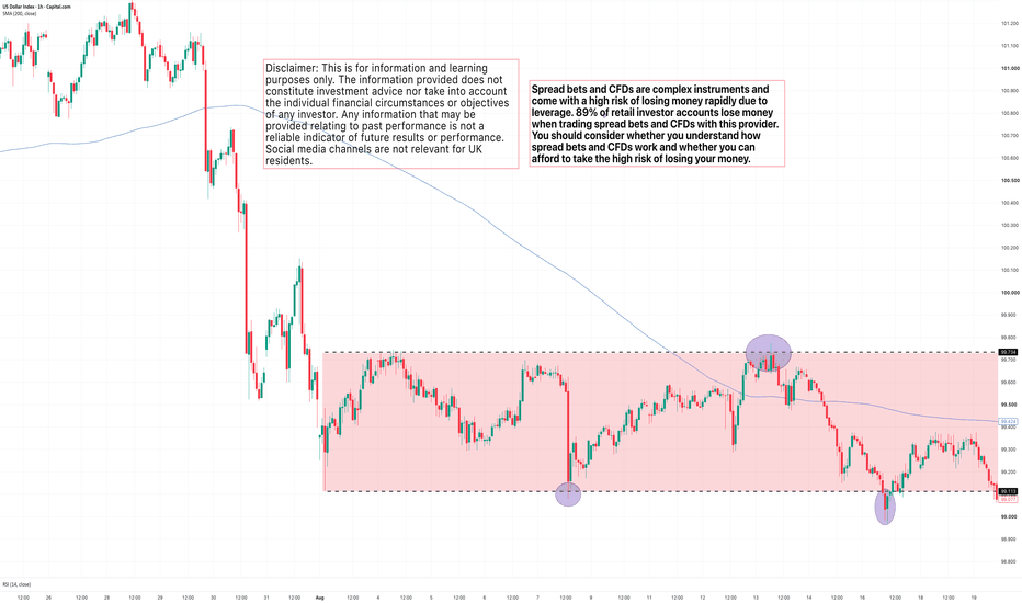
Three Early Signs Resistance Could HoldUnderstanding how to read the battle that takes place around a key resistance zone can make a significant difference to both trade selection and trade management. Sell too early and you risk fading a trend that still has momentum behind it. Wait too long and much of the move may already have unfolded. The challenge isn't identifying where resistance sits; it's recognising when buyers are beginning to lose control.
The FTSE 100's recent test of its all-time highs provides a useful example. Rather than focusing on the eventual move lower, let's look at three subtle changes in price action that suggested resistance was becoming increasingly difficult to overcome before the decline gathered momentum.
1. Failure to close above resistance
The first warning sign often isn't that price fails to trade above resistance. Strong trends frequently push through important levels as buyers test whether the market is willing to accept higher prices.
The more important question is what happens by the close.
When the market repeatedly probes above resistance but finishes the session back beneath it, it suggests that buying enthusiasm is being met by sufficient selling pressure to prevent the breakout from holding. One failed close isn't enough to conclude that resistance will hold, but it should encourage you to pay closer attention to how price behaves during subsequent tests.
FTSE 100 Daily Candle Chart
Past performance is not a reliable indicator of future results
During the FTSE 100's initial test of its all-time highs, buyers briefly traded above resistance but were unable to maintain those gains into the close. Rather than confirming a breakout, the session left behind an early indication that sellers were still prepared to defend the level.
2. Repeated rejection from resistance
Markets rarely give up after a single attempt. When a trend remains healthy, buyers will often return to challenge the same resistance zone multiple times.
What matters is whether each attempt is making genuine progress.
In the FTSE's case, buyers continued revisiting the highs, but each rally quickly stalled around the same area. Instead of seeing strong closes above resistance and an expansion in momentum, price began clustering beneath the highs in a series of relatively small daily candles.
That type of behaviour often reflects hesitation rather than conviction. Buyers are still present, but they are no longer demonstrating the same ability to establish acceptance above resistance.
FTSE 100 Daily Candle Chart
Past performance is not a reliable indicator of future results
By this stage, the evidence had started to build. One failed breakout can be dismissed as noise. Several failed attempts at the same level begin to suggest that resistance is becoming increasingly difficult to overcome.
3. The first break of structure on a lower timeframe
The daily chart tells us that buyers are struggling. The hourly chart helps us identify when that loss of momentum begins to translate into a genuine change in market structure.
One of the earliest signs is the first break of the sequence of higher highs and higher lows that has been supporting the advance. Once price produces its first lower low, buyers are no longer maintaining control of the short-term trend and the probability of resistance continuing to hold begins to increase.
This doesn't confirm that a larger reversal will follow, but it does provide additional evidence that the balance between buyers and sellers is changing.
FTSE 100 Hourly Candle Chart
Past performance is not a reliable indicator of future results
The hourly chart shows the first meaningful break of structure developing after several unsuccessful tests of resistance. While the daily chart was already highlighting weakening buying pressure, the lower timeframe provided a more timely indication that momentum was beginning to shift.
FTSE 100 Hourly Candle Chart
Past performance is not a reliable indicator of future results
The move that followed illustrates why many traders prefer to let the evidence build rather than reacting to the very first rejection. By combining the higher timeframe picture with a lower timeframe change in structure, traders were able to make decisions based on evolving market behaviour rather than trying to predict the exact turning point.
Build the evidence
Resistance rarely announces itself with a single candle. More often, the clues develop gradually as buyers lose momentum and sellers become increasingly willing to defend the same area.
A failure to close above resistance, repeated rejection from the highs and the first lower timeframe break of structure don't guarantee that a reversal will follow. Together, however, they represent a meaningful shift in market behaviour that can help traders assess whether the balance of probability is beginning to favour the sellers.
Disclaimer: This is for information and learning purposes only. The information provided does not constitute investment advice nor take into account the individual financial circumstances or objectives of any investor. Any information that may be provided relating to past performance is not a reliable indicator of future results or performance. Social media channels are not relevant for UK residents.
Spread bets and CFDs are complex instruments and come with a high risk of losing money rapidly due to leverage. 89% of retail investor accounts lose money when trading spread bets and CFDs with this provider. You should consider whether you understand how spread bets and CFDs work and whether you can afford to take the high risk of losing your money.
Reading Nvidia's Technical Strength Ahead of EarningsNvidia's August rally has reshaped the technical picture ahead of next week's Q2 earnings. Let's take a look at what the recent price action is telling us, and where the balance of risk and reward now sits as the market heads into one of its biggest catalysts of the quarter...
The recovery has rebuilt confidence
July's double bottom around the 200-day moving average proved to be far more significant than a routine technical bounce. It marked the point where buyers consistently rejected lower prices, preventing the previous correction from developing into a broader change in trend.
Improving sentiment towards the wider AI sector helped reinforce that recovery. Fresh capital expenditure commitments from the major cloud providers eased concerns that AI spending was beginning to slow, while renewed confidence in long-term infrastructure investment encouraged investors back into the sector. Nvidia responded by breaking decisively above the July resistance area, but the more revealing development has been how the shares have behaved since.
Nvidia Daily Candle Chart
Past performance is not a reliable indicator of future results
Markets driven purely by short-term enthusiasm often struggle to hold onto breakouts. Nvidia has taken a different path. Rather than immediately filling the August gap or falling back below former resistance, buyers have continued accepting higher prices. That suggests the breakout has become an area of value rather than simply a temporary burst of momentum.
The pause may matter more than the rally
The four-hour chart adds another important layer to the story. Since the strong advance at the beginning of August, Nvidia has spent several sessions consolidating its gains while trading volumes have gradually declined.
At first glance, lighter volume can sometimes be interpreted as fading buying interest. Ahead of a major earnings announcement, however, it can also reflect a market becoming more selective. Existing holders appear comfortable maintaining positions, while many new participants are waiting for fresh information before committing additional capital.
Equally important is the way the market has chosen to consolidate. Rather than retracing a meaningful proportion of the August advance, Nvidia has largely moved sideways, allowing the shorter-term moving averages to catch up with price. Strong trends often pause through time rather than price, and so far that has been the characteristic of this recovery. While this pattern points to underlying strength, markets can turn unpredictably, and this consolidation should not be read as a guarantee of continued upside.
Nvidia Four-Hour Candle Chart
Past performance is not a reliable indicator of future results
As earnings approach, the gap above July resistance becomes an increasingly important reference point. If any initial weakness continues to attract buyers above that former resistance, it would reinforce the view that the market remains comfortable with Nvidia's higher valuation. A decisive move back below it would suggest that much of the recent rally reflected pre-earnings positioning rather than a lasting shift in conviction.
Disclaimer: This is for information and learning purposes only. The information provided does not constitute investment advice nor take into account the individual financial circumstances or objectives of any investor. Any information that may be provided relating to past performance is not a reliable indicator of future results or performance. Social media channels are not relevant for UK residents.
Spread bets and CFDs are complex instruments and come with a high risk of losing money rapidly due to leverage. 89% of retail investor accounts lose money when trading spread bets and CFDs with this provider. You should consider whether you understand how spread bets and CFDs work and whether you can afford to take the high risk of losing your money.
Brent Crude and the Battle Between Two VWAPsBrent crude has spent much of the past month caught between two competing macro narratives. Supply disruption across the Middle East continues to underpin prices, while weaker demand forecasts and slowing global growth have limited the market's ability to sustain rallies.
One of the clearest ways of visualising that tension comes from two Anchored VWAPs, each highlighting where different groups of market participants are beginning to influence price action.
Supply and demand remain at odds
The macro backdrop continues to send mixed messages. On one side, shipping disruption through the Strait of Hormuz, constrained alternative export routes and declining global inventories continue to provide an important floor beneath oil prices. The International Energy Agency estimates that global inventories fell sharply during July, reflecting the logistical disruption created by reduced oil shipments.
Against that sits a very different narrative. Both the IEA and OPEC have lowered their demand expectations as concerns over global growth continue to build, while a surprisingly large increase in US crude inventories has reinforced the view that parts of the market remain well supplied. Many institutions still expect Brent to trade lower into year-end as supply chains gradually normalise and demand softens.
The battle between two VWAPs
One of the more interesting features on the chart comes from two Anchored VWAPs.
The first is anchored to the April high, when Brent's broader decline began. That VWAP now sits close to the $90 area, reinforcing a level that has repeatedly capped recent rallies. Rather than acting as resistance simply because previous highs sit nearby, it also represents the average price paid by traders who bought before the decline gathered pace. As Brent approaches that level, many of those participants are getting close to breakeven, increasing the likelihood of selling pressure as positions are reduced.
The second VWAP is anchored to the July low, where Brent began its recovery. Here the picture is very different. Buyers who entered during that rebound continue to hold profitable positions, and recent pullbacks have repeatedly found support around that average price. Rather than aggressively taking profits, those participants have so far shown a willingness to defend the recovery.
The result is a market caught between two competing groups. One continues to sell strength near the April VWAP, while the other continues to buy weakness around the July VWAP.
Brent Crude Daily Candle Chart
Past performance is not a reliable indicator of future results
What traders should watch next
This creates a useful framework for the sessions ahead. A move above $90 on its own may not be enough to suggest the balance has shifted. What may, potentially, be more important Brent can remain above the April high VWAP after any initial breakout attempt, potentially signalling that buyers are beginning to absorb the supply that has repeatedly emerged around that level.
On the downside, a decisive break beneath the July low VWAP would potentially suggest the buyers who have supported the recovery are beginning to lose conviction. Until one of those groups gives way, Brent may continue to rotate between the two average prices rather than developing a sustained trend.
Brent Crude Four-Hour Candle Chart
Past performance is not a reliable indicator of future results
Disclaimer: This is for information and learning purposes only. The information provided does not constitute investment advice nor take into account the individual financial circumstances or objectives of any investor. Any information that may be provided relating to past performance is not a reliable indicator of future results or performance. Social media channels are not relevant for UK residents.
Spread bets and CFDs are complex instruments and come with a high risk of losing money rapidly due to leverage. 89% of retail investor accounts lose money when trading spread bets and CFDs with this provider. You should consider whether you understand how spread bets and CFDs work and whether you can afford to take the high risk of losing your money.
Why Yesterday's Point of Control MattersMost traders begin the session by marking out the previous day's high and low. Those levels often provide a useful framework for the day ahead, highlighting where momentum accelerated or where buyers and sellers previously lost conviction. Yet another reference point often receives far less attention despite representing where the market spent most of its time doing business.
The Prior Day's Point of Control (PoC) , derived from the Session Volume Profile, identifies the price at which the greatest volume traded during the previous session. It isn't a buy or sell signal, nor should it automatically be treated as support or resistance. Instead, it provides a useful reference point that can help traders understand where the market previously found the greatest agreement on price. Three observations are particularly worth paying attention to.
Strong trends often see value move higher
One of the more interesting characteristics of strong trends is that they aren't driven purely by price. As markets continue to trend, the Point of Control will often migrate higher from one session to the next.
The market isn't simply pushing to higher prices before immediately rejecting them. Instead, the greatest concentration of trading activity is gradually shifting upwards as buyers and sellers become increasingly willing to transact at higher prices.
This doesn't guarantee the trend will continue, but it does suggest that the market is accepting those higher prices rather than merely visiting them.
US500 Five-Minute Candle Chart
Past performance is not a reliable indicator of future results
The recent S&P 500 provides a good example. As the market continued to rally, each session's Point of Control gradually stepped higher. Rather than repeatedly returning to previous value areas, the market established new areas where the majority of business was conducted, consistent with the strength of the underlying trend.
The prior day's Point of Control creates a useful reference
Once the session closes, yesterday's Point of Control becomes a level worth carrying forward into the next trading day.
Not because the market must react there, but because it highlights an area where a significant amount of business was previously transacted. Whenever price returns to that level, traders have an opportunity to observe whether the market still considers it an area of value or whether sentiment has shifted.
US500 Five-Minute Candle Chart
Past performance is not a reliable indicator of future results
Here, the Session Volume Profile identifies the price where the greatest volume traded throughout the session. While the profile itself disappears once the day has finished, the Point of Control remains a useful reference point that can be projected into the following trading session.
Watch the reaction, not the level
Perhaps the biggest mistake traders make is assuming the Prior Day's Point of Control should automatically act as support or resistance.
Like every technical level, its value comes from how the market behaves around it rather than from the line itself.
Sometimes price will trade straight through it without hesitation, signalling that yesterday's area of value is no longer particularly relevant. On other occasions, the market will repeatedly struggle to establish itself above or below the level, suggesting participants are once again making decisions around the same price.
Repeated reactions often become far more meaningful than the first touch.
US500 Five-Minute Candle Chart
Past performance is not a reliable indicator of future results
In this example, price repeatedly tested the Prior Day's Point of Control from below before failing to establish acceptance above it. Each rejection reinforced the level as an area where selling pressure re-emerged , providing traders with a useful intraday reference rather than a mechanical trading signal.
A reference point rather than a prediction
The Prior Day's Point of Control won't identify every turning point, nor should it be expected to. Its real value lies in providing additional context.
Like any technical tool, the Point of Control can provide additional context when considered as part of a broader analytical framework.. Used in isolation it is simply another horizontal line. Used alongside price action, it becomes a practical way of identifying where yesterday's auction may still be influencing today's decisions.
Disclaimer: This is for information and learning purposes only. The information provided does not constitute investment advice nor take into account the individual financial circumstances or objectives of any investor. Any information that may be provided relating to past performance is not a reliable indicator of future results or performance. Social media channels are not relevant for UK residents.
Spread bets and CFDs are complex instruments and come with a high risk of losing money rapidly due to leverage. 89% of retail investor accounts lose money when trading spread bets and CFDs with this provider. You should consider whether you understand how spread bets and CFDs work and whether you can afford to take the high risk of losing your money.
 Education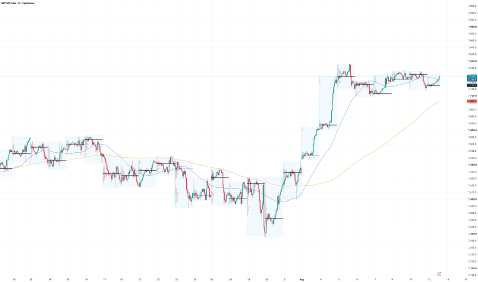
SpaceX: Relief Rally or Trend Reversal?Earlier in the week, investors were focused on rising AI spending and the impending post-IPO lock-up expiry. By Friday, attention had shifted towards accelerating AI revenues, improving returns on AI investment and the fact that insiders hadn't rushed for the exit. Whether that change in sentiment develops into a broader trend reversal is now becoming a question for the chart rather than the headlines.
The narrative has changed
SpaceX's first quarterly results as a public company gave investors plenty to think about. Revenue almost doubled compared with a year earlier, supported by continued growth across Starlink and the company's expanding AI business. Management also argued that its AI infrastructure is beginning to generate returns far more quickly than many had expected, with new compute capacity paying for itself in less than a year.
Earlier in the week, however, those positives were largely overshadowed by concerns over the sheer scale of investment required to deliver that growth. Capital expenditure remained exceptionally high, free cash flow stayed negative and investors questioned how long Starlink's cash generation could continue funding such an ambitious expansion.
By the end of the week, the conversation had changed. The first post-IPO lock-up period passed without the wave of insider selling many had anticipated, removing one of the market's biggest concerns almost overnight. An analyst upgrade and improving sentiment across the tech sector added further support, allowing investors to place greater emphasis on the company's longer-term growth prospects rather than its near-term spending requirements.
A key retest of broken support
The technical picture naturally reflects the improving shift in sentiment.
After falling almost 30% from the July highs, SpaceX has established a triple bottom around the $107 area before producing its first higher swing high for several weeks. That sequence matters because it interrupts the pattern of lower highs and lower lows that had defined the previous decline and suggests sellers are no longer exerting the same degree of control.
Friday's break above the early August swing high strengthened that message further by confirming the first meaningful higher high of the recovery. On the four-hour chart, the 9-period EMA has also crossed above the 21-period EMA, with both averages now beginning to turn higher. While moving averages should never be viewed in isolation, they reinforce the view that short-term momentum is becoming increasingly constructive.
The next technical challenge now comes into view around $150. When that level broke in July it triggered an aggressive acceleration lower, making it one of the most important technical reference points on the chart. Markets often revisit former support after a major breakdown, and the reaction around those levels can provide valuable insight into whether sentiment has genuinely improved or whether sellers are simply waiting for higher prices to re-enter.
If buyers can continue defending higher lows as the recovery develops, attention is likely to remain focused on that $150 area. How the shares behave once they get there may ultimately tell traders far more than last week's impressive rally.
SpaceX Four-Hour Candle Chart
Past performance is not a reliable indicator of future results
Disclaimer: This is for information and learning purposes only. The information provided does not constitute investment advice nor take into account the individual financial circumstances or objectives of any investor. Any information that may be provided relating to past performance is not a reliable indicator of future results or performance. Social media channels are not relevant for UK residents.
Spread bets and CFDs are complex instruments and come with a high risk of losing money rapidly due to leverage. 89% of retail investor accounts lose money when trading spread bets and CFDs with this provider. You should consider whether you understand how spread bets and CFDs work and whether you can afford to take the high risk of losing your money.
Can Gold Build on Its Short-Term Momentum?Gold has finally broken out of the tight structure that contained price through July, with last week’s rally carrying the market back above its 50-day moving average and through the most recent descending trendline.
The short-term picture has improved quickly, but the broader correction has not disappeared. The question now is whether buyers can turn that burst of momentum into something more durable as price approaches heavier resistance overhead.
Macro catalysts finally release the pressure
For much of the year, gold has struggled with a difficult macro mix. Higher energy prices kept inflation risks alive, the Fed had little reason to sound softer and the dollar remained firm enough to keep pressure on precious metals. Last week finally loosened that combination.
The easing in Middle East tensions took some of the heat out of oil, while weaker US employment data reduced the urgency around further tightening. That mattered because gold was already sitting in a technical structure where selling pressure had been losing momentum. Once the macro backdrop stopped working against the market, the balance shifted quickly.
XAU/USD Daily Candle Chart
Past performance is not a reliable indicator of future results
What is more important than the headlines themselves is how decisively price responded. Previous rallies throughout the correction struggled to get through the 50-day moving average and failed beneath descending resistance. This time, gold moved through both with far less hesitation, suggesting the market was not simply reacting to one data point but beginning to reassess the broader policy backdrop.
That still leaves an important distinction between short-term momentum and a confirmed change in the longer-term trend. The 200-day moving average remains overhead, while the broader descending structure from the February highs is still intact. Gold has improved its position, but it has not yet cleared the levels that would force a more substantial rethink of the wider correction.
A change of character
The four-hour chart shows why the latest move deserves more attention than the previous recovery attempts.
Through July, the market repeatedly failed to build momentum away from support. Rallies stalled, sellers returned and price was pushed back into the same contracting range. That behaviour changed last week. Once the upper boundary gave way, buying became more persistent and pullbacks remained shallow, allowing price to extend without immediately giving back the breakout.
That is the key difference. Gold has moved from a market where rallies were consistently sold into one where buyers are, for now, prepared to defend higher prices. It does not confirm a new trend on its own, but it may indicate a change in short-term market behaviour compared with earlier in the year.”.
XAU/USD Four-Hour Candle Chart
Past performance is not a reliable indicator of future results
If the first retracement remains controlled and buyers continue to defend above the former breakout area, confidence in the short-term shift would continue to build. A deeper move back into the old range would raise a different question, suggesting last week’s rally was driven more by short covering and a rapid adjustment in expectations than by a lasting improvement in demand.
For now, the focus is less on chasing the move and more on how gold behaves once momentum cools. The way buyers respond to the first proper pullback should provide the clearest indication of whether this short-term improvement has enough support to challenge the broader downtrend.
Disclaimer: This is for information and learning purposes only. The information provided does not constitute investment advice nor take into account the individual financial circumstances or objectives of any investor. Any information that may be provided relating to past performance is not a reliable indicator of future results or performance. Social media channels are not relevant for UK residents.
Spread bets and CFDs are complex instruments and come with a high risk of losing money rapidly due to leverage. 89% of retail investor accounts lose money when trading spread bets and CFDs with this provider. You should consider whether you understand how spread bets and CFDs work and whether you can afford to take the high risk of losing your money.
 Education

Trading Around All-Time HighsThe S&P 500 has once again moved into record territory. Whenever that happens, the debate quickly shifts away from what price is doing towards what traders think it should do. Has the market gone too far? Is it too expensive? Should we wait for a pullback before getting involved?
Trading around all-time highs requires a slightly different way of thinking. Rather than focusing on the fact that price has reached a record, its good to focus on how the market behaves once it gets there.
Assumption One: There Is No Resistance
One of the most common observations when a market reaches an all-time high is that there is "no resistance overhead". While it's true there are no historical prices above the market, concluding that resistance has therefore disappeared oversimplifies how price actually moves.
Resistance isn't created solely by previous highs. It develops wherever buying and selling temporarily fall out of balance.
As markets move into record territory, traders begin making decisions. Some take profits after an extended rally, others look for confirmation that the breakout is genuine, while shorter-term participants search for opportunities on both sides of the market. The result is often a period where price rotates around the breakout level rather than accelerating immediately away from it.
This is one reason why lower timeframe analysis can become increasingly valuable. While the daily chart may have entered price discovery, four-hour or one-hour charts continue to develop swing highs, swing lows and areas where liquidity begins to build. Those shorter-term structures often provide the technical reference points for managing trades once the higher timeframe resistance has been overcome.
S&P 500 Four-Hour Candle Chart
Past performance is not a reliable indicator of future results
Assumption Two: The Market Must Be Too Expensive
Buying at an all-time high rarely feels comfortable.
Nobody wants to be the trader who buys the final push before a major reversal. The problem is that price alone tells us very little about whether a market is genuinely expensive.
A chart measures where the market is trading. It doesn't tell us whether that price is justified.
Recent earnings season demonstrated that point well. Corporate earnings have continued surprising to the upside, with analysts revising expectations higher following another round of stronger-than-expected results. Markets don't reach record highs simply because investors become more optimistic. Quite often they reach them because expectations around future earnings continue improving.
That doesn't mean every breakout will succeed, nor does it mean valuations can never become stretched. It simply reminds us that an all-time high is not, by itself, evidence that a market has become overvalued.
For traders, the more productive question is rarely whether the market is expensive. It's whether the trade offers a favourable balance between risk and reward. Clearly defining risk parameters and recognising that any individual trade may not develop as expected can help reduce some of the emotion that naturally surrounds buying strength.
Assumption Three: Waiting For A Pullback Is Always Safer
Technical analysis textbooks often encourage traders to wait for price to break resistance before buying the first pullback into the breakout level. It's a sensible framework and, in many cases, an effective one.
The difficulty comes when it becomes the only framework.
Strong trends don't always provide the textbook retest that traders hope for. Sometimes acceptance develops through a clean pullback into previous resistance. At other times, the market simply consolidates above the breakout before continuing higher. Occasionally, it offers no meaningful retracement at all.
Being too rigid can therefore become just as costly as chasing price.
The objective isn't to buy every breakout or to insist on the perfect entry. It's to apply the same process consistently. When position sizing and risk management are doing their job, each trade becomes one of many rather than one that has to be right. That shift in mindset often makes it much easier to trade markets making new highs without feeling the need to predict exactly what happens next.
Trade The Price, Not The Assumption
All-time highs tend to generate strong opinions because they sit at the intersection of optimism and uncertainty. For some, they represent confirmation that the trend remains intact. For others, they are evidence that the market has finally gone too far.
Neither conclusion can be reached from price alone.
The more useful approach is to treat record highs like any other important technical area. Observe how price behaves around them, pay attention to the quality of the breakout rather than the breakout itself, and remain disciplined with risk management if the market proves your original idea wrong.
Record highs are not a signal to become either bullish or bearish. They are simply another environment that asks traders to remain objective while allowing price, rather than assumption, to shape the next decision.
Disclaimer: This is for information and learning purposes only. The information provided does not constitute investment advice nor take into account the individual financial circumstances or objectives of any investor. Any information that may be provided relating to past performance is not a reliable indicator of future results or performance. Social media channels are not relevant for UK residents.
Spread bets and CFDs are complex instruments and come with a high risk of losing money rapidly due to leverage. 89% of retail investor accounts lose money when trading spread bets and CFDs with this provider. You should consider whether you understand how spread bets and CFDs work and whether you can afford to take the high risk of losing your money.
Education 
USD/JPY Faces Its First Test After InterventionSpeculation of intervention had been building for weeks as USD/JPY climbed back towards its 2024 highs. What caught markets off guard was the coordinated action with the US Treasury, giving last week's intervention considerably more credibility than many had anticipated.
The sharp sell-off dominated the headlines, but the next question is how markets respond . As USD/JPY begins its first meaningful recovery on lower timeframes, the market may reveal whether last week's intervention marked a temporary interruption or the beginning of a broader change in character.
The long-term trend still holds
The weekly chart provides some valuable perspective.
Before last week's intervention, USD/JPY had been in a well-established uptrend for almost two years, consistently producing higher highs and higher lows while remaining supported by its long-term trendline. The move above the previous highs suggested buyers were once again attempting to extend that trend.
Last week's intervention interrupted that momentum, but it has not yet dismantled the broader structure. The long-term trendline remains intact and the sequence of higher swing lows has yet to be broken.
USD/JPY Weekly Candle Chart
Past performance is not a reliable indicator of future results
Large policy-driven moves often dominate short-term sentiment, but they do not automatically end established trends. From a longer-term perspective, the market has been challenged rather than defeated.
The daily chart tells a different story
The daily timeframe paints a more cautious picture.
Months of steady technical progress were unwound in just two trading sessions. USD/JPY broke back below the previous breakout area around ¥162, fell through its rising trendline and slipped beneath the 50-day moving average. More importantly, the character of the market changed almost overnight.
For much of the past year, periods of weakness were generally followed by renewed buying interest in line with the prevailing trend. Last week's intervention challenges that assumption. The market is no longer behaving as it was before, and that alone suggesting the previous technical framework may no longer apply. .
USD/JPY Daily Candle Chart
Past performance is not a reliable indicator of future results
The coordinated nature of the intervention also changes the backdrop. Markets had been expecting Japan to defend the yen if necessary. The willingness of the US Treasury to participate adds another dimension, increasing the credibility of future intervention should USD/JPY once again come under upward pressure.
The first recovery could be the real signal
The four-hour chart now becomes the key tactical timeframe.
Following last week's sharp decline, USD/JPY has started to recover as short-term buyers return to the market. Under different circumstances, this type of bounce would often be viewed as a routine pullback opportunity within a broader uptrend.
This time, however, the recovery carries greater significance.
The next area to watch is the zone that acted as as support before last week's intervention. If buyers struggle to reclaim that zone and momentum begins to fade, it would suggest the market is starting to accept lower prices following the intervention, strengthening the argument that the daily change in character is beginning to influence the broader trend.
Equally, a decisive recovery back through the broken support would indicate buyers remain willing to challenge last week's move despite the prospect of further official action. That would not eliminate intervention risk, but it would suggest the longer-term trend still commands enough conviction to absorb last week's shock.
USD/JPY Four-Hour Candle Chart
Past performance is not a reliable indicator of future results
Rather than focusing on whether intervention happens again, traders may learn more by watching how the market behaves during this first recovery. The reaction around former support is likely to provide a clearer indication of conviction than the intervention itself.
Disclaimer: This is for information and learning purposes only. The information provided does not constitute investment advice nor take into account the individual financial circumstances or objectives of any investor. Any information that may be provided relating to past performance is not a reliable indicator of future results or performance. Social media channels are not relevant for UK residents.
Spread bets and CFDs are complex instruments and come with a high risk of losing money rapidly due to leverage. 89% of retail investor accounts lose money when trading spread bets and CFDs with this provider. You should consider whether you understand how spread bets and CFDs work and whether you can afford to take the high risk of losing your money.
Has the FTSE's Breakout Already Failed?Last week looked like a major breakthrough for the FTSE 100. After months of trading beneath the February highs, the index finally pushed into fresh record territory. Yet by the end of the week, buyers had failed three times to hold those gains. That doesn't necessarily mean the breakout has failed, but it does make this week's price action especially important. The market has now reached the point where it needs to prove those higher prices can be sustained.
Three Attempts, Three Weak Closes
A breakout is only the first step. What matters next is whether the market accepts those higher prices.
The FTSE spent much of last week trying to do exactly that. Wednesday saw the index test the February highs before closing back beneath them. Thursday brought a more convincing push into fresh all-time highs, only for much of the breakout to fade before the closing bell. Friday then produced another attempt to build on those gains, but once again buyers lost momentum into the close.
Viewed individually, none of those sessions would be especially concerning. Together, however, they suggest buyers are beginning to meet more determined selling as the index trades in uncharted territory. That's not enough to declare the breakout has failed, but it does mean the market has yet to demonstrate clear acceptance of these higher prices.
UK100 Daily Candle Chart
Past performance is not a reliable indicator of future results
One reason the pullback has remained relatively contained is the breadth beneath the surface. Financials, defence stocks, energy and miners have all continued to provide support over the past week, even as some heavyweight names such as AstraZeneca and Barclays have lagged. That broader participation has helped prevent the selling from becoming more widespread.
The Four-Hour Chart Holds the Answer
The four-hour chart provides the framework for what comes next.
Despite the weaker closes at the end of last week, the broader sequence of higher lows remains intact and the July breakout above 10,725 has not yet been broken. From a tactical perspective, that keeps the recent weakness firmly in the category of a pullback rather than a confirmed reversal.
That leaves two scenarios to watch. If buyers step back in and reclaim last week's highs, it would suggest the recent selling was simply profit taking after a strong advance, reinforcing the broader uptrend. However, a decisive move back beneath the July breakout level would begin to undermine last week's breakout, increasing the probability that the move above the February highs was premature rather than the start of a sustained leg higher.
UK100 Four-Hour Candle Chart
Past performance is not a reliable indicator of future results
For now, the breakout remains intact. Whether it develops into a lasting move or becomes a failed breakout is likely to be the FTSE's most important question this week.
Disclaimer: This is for information and learning purposes only. The information provided does not constitute investment advice nor take into account the individual financial circumstances or objectives of any investor. Any information that may be provided relating to past performance is not a reliable indicator of future results or performance. Social media channels are not relevant for UK residents.
Spread bets and CFDs are complex instruments and come with a high risk of losing money rapidly due to leverage. 89% of retail investor accounts lose money when trading spread bets and CFDs with this provider. You should consider whether you understand how spread bets and CFDs work and whether you can afford to take the high risk of losing your money.
 Education
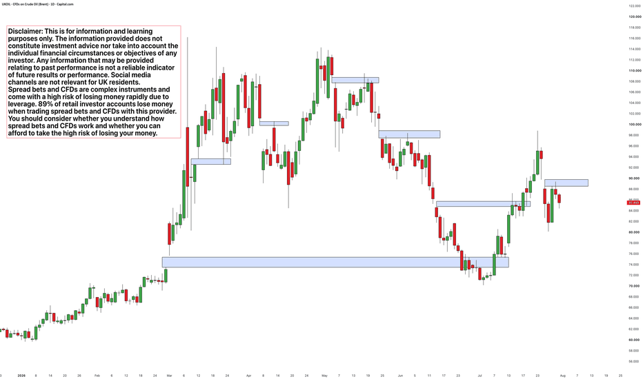
Elevating Your S&P 500 AnalysisIf you trade the S&P 500 regularly, one way to elevate your analysis is to spend a little less time looking at the index itself and a little more time looking at the markets around it.
The S&P 500 doesn't trade in isolation. The US dollar, Treasury yields and market volatility are all responding to the same macroeconomic forces and, together, can provide valuable context for the move already taking place on the chart.
None of these markets should be viewed as predictors of the S&P 500. Instead, they help answer a broader question: is the current environment becoming more supportive or more challenging for risk assets?
One dashboard can help bring that bigger picture into focus.
A Simple S&P 500 Dashboard
Past performance is not a reliable indicator of future results
The S&P 500 remains the market being traded. The US Dollar Index, US 10-Year Treasury Yield and the VIX provide context before committing capital. Individually they rarely tell the whole story. Together they can offer a broader perspective on the environment in which the index is trading.
Read The Dollar
Rather than asking whether the dollar predicts the next move in the S&P 500, it can be more useful to ask whether it supports the move already underway.
A strengthening dollar often creates a more challenging backdrop for equities by tightening financial conditions, while a weaker dollar can provide a tailwind for risk assets. The relationship is far from perfect, but when both markets begin reinforcing the same message, confidence in the prevailing trend often increases.
The current dashboard provides an interesting example. While the S&P 500 is attempting to recover from recent weakness, the US Dollar Index continues to hold a sequence of higher highs and higher lows. That doesn't automatically prevent equities from moving higher, but it does suggest the macro backdrop remains firmer than the S&P 500 chart alone might imply. As always, markets can shift quickly, and this dynamic should be watched rather than treated as a fixed outcome.
Read Bond Yields
Treasury yields provide another useful layer of context.
Higher yields generally reflect tighter financial conditions and increase the opportunity cost of holding risk assets, particularly higher-growth companies whose valuations are more sensitive to changes in interest rates. Falling yields can often provide a more supportive backdrop.
Once again, the current dashboard tells an interesting story. The US 10-Year Treasury Yield continues to trend higher, reinforcing the message coming from the dollar. Viewed together, both markets suggest the broader macro backdrop remains relatively restrictive despite the S&P 500's recent recovery.
That doesn't mean the rally cannot continue. It simply means the market is attempting to move higher without the support of two important macro indicators.
Read Volatility
The final piece of the dashboard is the VIX.
Rather than concentrating on whether volatility is simply high or low, it is often more useful to ask whether it is confirming the message coming from equities.
A falling VIX alongside a rising S&P 500 generally reflects improving investor confidence. Conversely, if the S&P 500 pushes towards new highs while the VIX refuses to decline or begins rising, it may suggest investors remain cautious beneath the surface.
Unlike the dollar and Treasury yields, the VIX is currently sending a more neutral message. Volatility remains relatively subdued despite recent market uncertainty, suggesting investors are not showing the elevated levels of fear often associated with sustained market declines.
Again, that isn't a trading signal in itself. It's simply another piece of evidence to weigh alongside the other charts.
Building Better Context
The biggest misconception surrounding intermarket analysis is that it should predict the next move in the S&P 500.
That isn't its purpose.
Price action should always remain the starting point. The dashboard simply helps explain the environment in which that price action is unfolding.
Sometimes the dollar, Treasury yields, volatility and the S&P 500 will all reinforce one another. Those are often the periods when trends develop with the greatest conviction. At other times they'll tell conflicting stories. That doesn't necessarily invalidate the trade, but it may justify reducing position size, tightening risk management or waiting for greater clarity.
Viewed that way, an intermarket dashboard becomes less about forecasting where the S&P 500 is heading next and more about understanding the conditions you're trading in.
Disclaimer: This is for information and learning purposes only. The information provided does not constitute investment advice nor take into account the individual financial circumstances or objectives of any investor. Any information that may be provided relating to past performance is not a reliable indicator of future results or performance. Social media channels are not relevant for UK residents.
Spread bets and CFDs are complex instruments and come with a high risk of losing money rapidly due to leverage. 89% of retail investor accounts lose money when trading spread bets and CFDs with this provider. You should consider whether you understand how spread bets and CFDs work and whether you can afford to take the high risk of losing your money.
GBP/USD Weakens Ahead of the Fed and BoEWith the Fed and BoE both announcing their latest policy decisions this week, GBP/USD could be heading into a more volatile period. The pair has already started to weaken ahead of the meetings, making the current technical picture worth paying close attention to.
Let's take a look at some potentially key levels and scenarios…
The Market Looks Beyond the Rate Decision
Should the Fed and BoE hold rates steady as expected this week, market attention is likely to shift towards the accompanying statements and press conferences; a surprise move on either side, however, would put the decision itself back in focus
For the Fed, resilient economic data continues to sit alongside moderating inflation, leaving policymakers in little rush to signal their next move. The BoE faces a different balancing act. Inflation has eased and UK growth remains subdued, but the recent rebound in oil prices has once again raised questions about how quickly inflationary pressures could return during the second half of the year.
With expectations for both meetings already fairly settled, it may only take a subtle shift in language to change how markets view the path of interest rates over the coming months. That places added importance on how GBP/USD responds once the announcements are out of the way.
Lower Highs Continue to Pressure Support
The daily chart shows a market that has struggled to build any lasting upside momentum since February. Each recovery has stalled below the previous swing high, creating a sequence of lower highs that continues to define the broader structure.
What makes the current setup interesting is the support zone beneath price. Buyers have repeatedly defended this area over recent months, preventing the broader decline from accelerating. At the same time, however, each rally has become progressively weaker, leaving sterling with less room to recover before fresh selling emerges.
This creates an increasingly important technical backdrop for this week's meetings. A supportive outcome from the BoE, or a softer tone from the Fed, would first need to break that sequence of lower highs before suggesting a more meaningful improvement in sentiment. Until then, the broader structure continues to favour rallies being viewed with caution.
GBP/USD Daily Candle Chart
Past performance is not a reliable indicator of future results
Short-Term Momentum Hinges on the Boundary
Since the middle of July, GBP/USD has been trading within a well-defined descending channel, producing a consistent sequence of lower highs and lower lows. The move has been orderly rather than aggressive, potentially suggesting sellers remain in control without the type of panic often associated with major breakdowns.
From a trading perspective, the channel offers a straightforward framework.The upper boundary remains the key level to watch; price continuing to hold below it keeps the current short-term structure in place, while a break above would mark a shift in that structure. A break beneath the recent lows could suggest sellers are attempting to extend the existing move and bring the longer-term support zone back into focus.
Equally, this week's central bank meetings have the potential to change that picture. A decisive break above the channel would represent a change of character. Until that happens, the lower timeframe continues to reinforce the cautious message already being shown by the daily chart.
GBP/USD Four-Hour Candle Chart
Past performance is not a reliable indicator of future results
Disclaimer: This is for information and learning purposes only. The information provided does not constitute investment advice nor take into account the individual financial circumstances or objectives of any investor. Any information that may be provided relating to past performance is not a reliable indicator of future results or performance. Social media channels are not relevant for UK residents.
Spread bets and CFDs are complex instruments and come with a high risk of losing money rapidly due to leverage. 89% of retail investor accounts lose money when trading spread bets and CFDs with this provider. You should consider whether you understand how spread bets and CFDs work and whether you can afford to take the high risk of losing your money.
Trading Tesla's Earnings BreakdownLarge earnings gaps happen every quarter. Some are quickly reversed, while others leave a lasting mark on the chart. Tesla's recent sell-off increasingly looks like the latter, with price action suggesting the market is beginning to accept a very different valuation.
For those watching the stock this week, the focus shifts from the earnings report itself to how price behaves around the levels that have already been lost.
A Different Technical Landscape
Tesla's earnings disappointed for several reasons. While revenue held up better than expected, collapsing margins, negative free cash flow and a sharp increase in AI-related spending forced investors to reassess the balance between long-term ambition and near-term profitability.
That reassessment was reflected immediately in the chart.
Tesla Daily Candle Chart
Past performance is not a reliable indicator of future results
Rather than finding buyers around the first obvious support levels, Tesla sliced through multiple areas including the key April lows. The move was accompanied by one of the strongest volume expansions seen this year, suggesting broad participation rather than a brief wave of panic selling.
What followed was equally important. Instead of rebounding aggressively from the gap lower, the stock made further losses throughout Thursdays session and closed on its lows. That lack of buying interest suggests the market is, for now, becoming comfortable with these lower prices rather than treating the sell-off as an overreaction.
The Next Pullback Could Be the Real Trade
The next pullback is likely to be far more revealing than the earnings gap itself.
Markets that have genuinely repriced rarely recover in a straight line. More often, they pause before revealing whether buyers are prepared to absorb supply at higher prices or whether sellers are still willing to use rallies as opportunities to reduce exposure.
If Tesla begins to drift sideways in a series of relatively small-range sessions near last week's lows, it would suggest the recent breakdown is becoming accepted rather than rejected. That type of price action would increase the probability that the market is simply pausing before attempting another move lower.
The broken April lows now become the key technical reference point. Former support often becomes the first meaningful test during any recovery, making it a logical area where sellers may look to reassert control. A rally that struggles beneath that level would reinforce the current bearish structure.
Equally, a decisive reclaim of the April lows would be the first meaningful sign that buyers are beginning to regain control, forcing those positioned for further downside to reassess the strength of the current trend.
Rather than focusing on the earnings report itself, the cleaner approach may now be to watch how the market behaves around those former support levels. That may provide a much clearer indication of conviction than the headline that triggered the move in the first place.
Disclaimer: This is for information and learning purposes only. The information provided does not constitute investment advice nor take into account the individual financial circumstances or objectives of any investor. Any information that may be provided relating to past performance is not a reliable indicator of future results or performance. Social media channels are not relevant for UK residents.
Spread bets and CFDs are complex instruments and come with a high risk of losing money rapidly due to leverage. 89% of retail investor accounts lose money when trading spread bets and CFDs with this provider. You should consider whether you understand how spread bets and CFDs work and whether you can afford to take the high risk of losing your money.
How to Read a Breakout
Every trader knows what a breakout looks like. Price pushes above resistance, momentum builds and buyers rush to join the move before they feel they have missed it. The difficult part is not identifying the breakout, but deciding whether it deserves your capital.
Apple’s recent move above the June highs provides a timely example. The breakout followed an important regulatory approval that moved Apple Intelligence closer to launching in China, while expanding volume suggested broad market participation. Just as importantly, the stock has so far continued to hold above its former resistance.
Whilst we can never know in advance whether a breakout will ultimately succeed or fail. What separates experienced traders is having a framework for assessing the quality of the breakout before entering the trade and managing it objectively afterwards. Three factors are especially useful:
• The catalyst behind the move
• The level of participation
• The market’s acceptance of higher prices
To see how these factors can shape both trade selection and trade management, it helps to compare two very similar Tesla breakouts from 2025 that produced very different outcomes.
A Tale of Two Breakouts
In September 2025, Tesla broke above several months of resistance after growing optimism surrounding its expanding energy generation and storage business. The move quickly developed into a sustained trend as buyers continued pushing the stock higher and price remained firmly above the former resistance area.
Tesla Four-Hour Candle Chart
Past performance is not a reliable indicator of future results
Three months later, Tesla appeared to produce another textbook breakout. This time, the catalyst was encouraging news surrounding its Robotaxi programme. The stock again pushed through resistance, attracted buyers and accelerated into fresh highs.
Tesla Four-Hour Candle Chart
Past performance is not a reliable indicator of future results
At first glance, the two trades looked very similar. Both had positive news behind them, both produced decisive breaks above resistance and both showed strong initial momentum. The difference only became clear as each breakout developed.
The September move continued attracting demand and held above the former resistance level. The December move quickly lost momentum before slipping back below the breakout area.
That contrast highlights why experienced traders continue analysing a breakout after they've entered the trade rather than assuming the job is done once resistance has broken.
Start With the Catalyst
Technical breakouts rarely happen in isolation. While price action determines the entry, understanding what is driving the move provides important context.
The September breakout was supported by improving expectations for Tesla's energy business, while the December move was driven by optimism around Robotaxis. Neither catalyst guaranteed success, but they explained why buyers were willing to pay higher prices.
Before trading any breakout, ask yourself one question:
Why are buyers prepared to pay higher prices today than they were yesterday?
A catalyst doesn't predict the outcome, but it explains why buyers may continue supporting the move after the breakout.
Look for Participation
The next clue comes from volume. Expanding volume suggests the breakout is attracting broad participation rather than a handful of buyers.
While no breakout is guaranteed to succeed, stronger candidates often share four characteristics:
• A meaningful resistance level
• A credible catalyst
• Expanding volume through the breakout
• Continued buying after resistance breaks
Volume doesn't predict the future, but it helps confirm conviction behind the move.
Watch for Acceptance
This is where trade management becomes just as important as trade selection.
After resistance breaks, ask whether the market is accepting the higher prices:
• Former resistance becomes support
• Pullbacks remain relatively shallow
• Buyers continue stepping in on weakness
• Price holds above the breakout level
Tesla's September breakout continued displaying these characteristics as buyers repeatedly defended the former resistance level. The December breakout didn't. Once price slipped back below resistance, the original breakout thesis had weakened.
Acceptance isn't designed to improve your entry. It's a way of deciding whether the trade still deserves your capital.
A breakout gets you into the trade. The market's acceptance of higher prices determines whether you stay in it.
Disclaimer: This is for information and learning purposes only. The information provided does not constitute investment advice nor take into account the individual financial circumstances or objectives of any investor. Any information that may be provided relating to past performance is not a reliable indicator of future results or performance. Social media channels are not relevant for UK residents.
Spread bets and CFDs are complex instruments and come with a high risk of losing money rapidly due to leverage. 89% of retail investor accounts lose money when trading spread bets and CFDs with this provider. You should consider whether you understand how spread bets and CFDs work and whether you can afford to take the high risk of losing your money.
 Education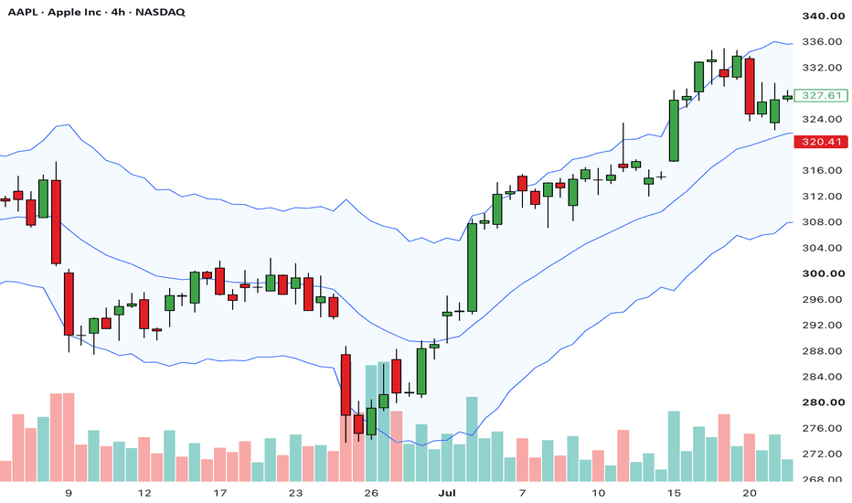
The Hidden Story Behind the FTSEIf you trade the FTSE 100, the chart is naturally where your analysis begins. Support and resistance, moving averages and price action will usually tell you whether buyers or sellers have the upper hand. That's exactly how it should be, because price is ultimately the only thing that matters.
The problem is that price doesn't always explain why the market is behaving the way it is.
Over the past four months, the FTSE has largely traded sideways between support around 10,170 and resistance near 10,725. Buyers have repeatedly stepped in around the lower end of the range, while every rally towards resistance has struggled to develop into a sustained breakout.
Even so, the broader picture remains constructive. The index continues to trade above rising 50 and 200-day moving averages, while the sequence of higher lows suggests the longer-term trend remains intact.
At first glance, it looks like a market waiting for its next catalyst.
UK100 Daily Candle Chart
Past performance is not a reliable indicator of future results
The chart, however, only tells part of the story.
One of the simplest ways to understand what's happening beneath the surface is to look at sector leadership. While the FTSE reflects the performance of the UK's largest listed companies, broader sector performance provides a useful indication of where capital is flowing across the market.
Comparing different timeframes often reveals changes in leadership long before they become obvious on the headline index.
How UK Market Leadership Has Changed
Past performance is not a reliable indicator of future results
The shift over recent months has been surprisingly significant.
Looking back over the past year, Materials have been comfortably the market's strongest-performing sector, followed by Financials and Energy. Those sectors helped drive much of the FTSE's advance and reflected a market that was rewarding banks, commodity producers and other cyclical businesses.
Fast forward to today and the picture looks pretty different.
Materials have fallen from the strongest-performing sector over the past year to one of the weakest across the three-month, one-month and one-week rankings. That's a big change in leadership over a relatively short period of time.
Financials tell almost the opposite story. Rather than fading alongside many of last year's winners, they have remained one of the market's strongest sectors across every timeframe, climbing to the top of the three-month rankings while continuing to perform well over both the monthly and weekly periods.
At the same time, Consumer Staples and Real Estate have quietly emerged as consistent leaders. Neither sector featured prominently over the longer term, yet both now sit near the top of the shorter-term rankings, suggesting institutional money has gradually been rotating into more defensive and interest rate-sensitive areas of the market.
Perhaps the most interesting point is that the FTSE itself hasn't changed very much while this has been happening.
The index has spent months consolidating within a relatively well-defined range, but beneath that stable headline performance the market's leadership has been quietly reshuffled. Capital doesn't appear to be leaving UK equities altogether. Instead, investors seem to be becoming more selective, reducing exposure to some of last year's strongest cyclical winners while favouring businesses with steadier earnings, resilient cash generation and, in the case of Real Estate, improving interest rate expectations.
This is why looking beyond the index itself can add another layer to your market analysis.
The FTSE chart tells you where the market is trading. Sector leadership tells you where money is flowing. Those aren't always the same thing, and when the two are considered together they often provide a much clearer picture of the market's underlying health.
Disclaimer: This is for information and learning purposes only. The information provided does not constitute investment advice nor take into account the individual financial circumstances or objectives of any investor. Any information that may be provided relating to past performance is not a reliable indicator of future results or performance. Social media channels are not relevant for UK residents.
Spread bets and CFDs are complex instruments and come with a high risk of losing money rapidly due to leverage. 89% of retail investor accounts lose money when trading spread bets and CFDs with this provider. You should consider whether you understand how spread bets and CFDs work and whether you can afford to take the high risk of losing your money.
EUR/USD Awaits an ECB Catalyst
Thursday's ECB rate decision arrives with the market already expecting a pause, meaning attention is likely to fall less on the decision itself and more on any change in the accompanying guidance.
From a technical perspective, the timing is interesting because EUR/USD has spent the past month building a tightening range, leaving the meeting with the potential to act as the catalyst rather than the story itself.
The daily chart suggests the market is waiting
The recent decline in EUR/USD carried the pair back into an important support zone created by the August 2025 and March 2026 lows. At first glance, the brief move below support looked as though it might develop into another leg lower. Instead, the selling quickly ran out of momentum and the market has spent the past few weeks consolidating around the level rather than moving away from it.
That behaviour is easy to overlook but it changes the way the chart should be read. Rather than treating support as a single price where buyers or sellers simply win the battle, the market has begun to use the area as a base, allowing volatility to contract while confidence gradually rebuilds. At the same time, the broader sequence of lower highs remains intact, leaving EUR/USD caught between longer-term resistance and a support zone that continues to attract demand.
EUR/USD Daily Candle Chart
Past performance is not a reliable indicator of future results
The result is a market that has become increasingly compressed. Neither buyers nor sellers have been able to establish enough conviction to force the next directional move, leaving price with progressively less room to continue moving sideways.
The Four-Hour Chart Defines the Trading Framework
The four-hour chart provides a much clearer view of how that compression has developed.
Since late June, buyers have consistently been prepared to step in at progressively higher prices, while sellers have continued to defend broadly the same resistance area. That shift in behaviour has steadily narrowed the trading range without either side giving up control, creating a technical structure that appears well suited to an event capable of increasing volatility.
This is where Thursday's ECB meeting becomes relevant. If the expected pause is accompanied by guidance that encourages buyers to push through trendline resistance, attention is likely to turn towards whether the broader correction is beginning to lose momentum. If, however, EUR/USD struggles to break higher despite the event risk, the inability to build on several weeks of consolidation may reinforce the existing downtrend instead.
EUR/USD Four-Hour Candle Chart
Past performance is not a reliable indicator of future results
Rather than focusing solely on the interest rate decision, we may find more value in studying the market's response. The statement will last a few minutes, but the price action that follows could offer a much clearer indication of which side has gained the upper hand.
Disclaimer: This is for information and learning purposes only. The information provided does not constitute investment advice nor take into account the individual financial circumstances or objectives of any investor. Any information that may be provided relating to past performance is not a reliable indicator of future results or performance. Social media channels are not relevant for UK residents.
Spread bets and CFDs are complex instruments and come with a high risk of losing money rapidly due to leverage. 89% of retail investor accounts lose money when trading spread bets and CFDs with this provider. You should consider whether you understand how spread bets and CFDs work and whether you can afford to take the high risk of losing your money.
US Banks: Reading the Reaction to EarningsEvery earnings season there is an understandable temptation to focus on whether a company beat analyst expectations. Earnings per share, revenue and guidance all matter, but they rarely tell the whole story. Once the numbers have been released, the market immediately begins answering a different question: were those results already reflected in the share price?
The quickest way to answer that question isn't by reading another earnings report. It's by studying the price action. This week's earnings from JPMorgan and Goldman Sachs provide two excellent examples of why the market's reaction often reveals more than the headline numbers themselves.
The Opening Move Isn't Always The Final Verdict
One of the easiest mistakes to make during earnings season is assuming the first move after the opening bell will define the day.
In reality, the opening reaction often reflects a battle between short-term traders taking profits, investors repositioning portfolios and institutions digesting new information. It can take several hours before the market reaches a clearer consensus.
JPMorgan demonstrated that perfectly.
Despite reporting another strong quarter, the shares initially traded lower before buyers gradually regained control throughout the session. By the closing bell, the stock had completely reversed the early weakness, producing a large bullish engulfing candle and finishing back at swing highs.
The earnings report didn't change during the day.
The market's interpretation of those earnings did.
JPMorgan Daily Candle Chart
Past performance is not a reliable indicator of future results
Rather than focusing solely on the earnings beat, the more useful observation is how quickly buyers absorbed the initial selling pressure. The recovery back towards the highs suggests the market remained comfortable paying premium valuations despite an early bout of profit taking.
Strong Results Don't Always Produce The Same Price Action
Goldman Sachs produced a very different reaction.
Instead of opening weak before recovering, the shares immediately attracted buyers following another impressive set of results. The stock gapped higher, strengthened throughout the trading session and broke above previous swing resistance before closing near the day's highs.
Both JPMorgan and Goldman Sachs delivered excellent quarters.
The difference wasn't the quality of the earnings.
It was how buyers responded once trading began.
This is an important distinction because earnings season isn't simply about whether companies beat forecasts. Positioning, expectations and investor sentiment all influence how the market chooses to respond after the announcement has been released.
Goldman Sachs Daily Candle Chart
Past performance is not a reliable indicator of future results
Unlike JPMorgan's recovery session, Goldman Sachs displayed immediate institutional demand. The breakout above previous resistance suggests buyers were prepared to build on the existing uptrend rather than waiting for further confirmation.
Read The Price, Not Just The Report
Bank of America delivered another useful reminder of this principle. Like JPMorgan, the shares initially weakened before recovering strongly into the close, reinforcing the idea that the opening reaction is not always the market's final verdict.
Perhaps that's the biggest lesson from the opening week of earnings season.
Markets don't reward companies simply for producing good results. They reward companies that exceed the expectations already reflected in their share price, and the easiest way to judge whether that has happened is often through the price action itself.
A stock that recovers from early selling to finish near its highs tells a very different story from one that gaps higher before fading into the close. Likewise, a stock that breaks to fresh highs immediately following an earnings release suggests buyers are prepared to continue paying higher prices despite already elevated expectations.
For traders, those subtle differences often provide more useful information than the earnings headlines themselves. Learning to read the market's reaction rather than simply the company's results can offer a valuable insight into institutional sentiment, helping distinguish between a positive earnings report and a genuinely bullish market response.
Disclaimer: This is for information and learning purposes only. The information provided does not constitute investment advice nor take into account the individual financial circumstances or objectives of any investor. Any information that may be provided relating to past performance is not a reliable indicator of future results or performance. Social media channels are not relevant for UK residents.
Spread bets and CFDs are complex instruments and come with a high risk of losing money rapidly due to leverage. 89% of retail investor accounts lose money when trading spread bets and CFDs with this provider. You should consider whether you understand how spread bets and CFDs work and whether you can afford to take the high risk of losing your money.
SpaceX's Starts to Trend Lower as Post-IPO Slump ContinuesSpaceX has slipped below the level where shares first began trading, extending a sharp reversal from last month's post-IPO rally. While the headlines remain mixed, the price action suggests the market is beginning to place greater emphasis on execution than ambition.
The IPO Narrative Begins to Evolve
The first few weeks following a high-profile IPO are often driven more by expectation than evidence. In SpaceX's case, investors were buying into a long-term vision centred around reusable launch technology, AI infrastructure and orbital data centres. That optimism helped propel the shares almost 50% above their opening trade within days of listing.
Over the past three weeks, however, the tone has started to change.
Supportive developments, including SpaceX's inclusion in the Nasdaq-100 and regulatory progress towards the next Starship flight, have struggled to generate sustained buying. Instead, the conversation has increasingly shifted towards profitability, execution and whether the company's longer-term ambitions can justify its valuation.
That change in focus is often worth paying attention to. Markets rarely abandon a growth story overnight. More commonly, confidence begins to fade when positive news no longer produces positive price action.
Support Gives Way
The four-hour chart now reflects that shift in sentiment.
Following the initial post-IPO rally, SpaceX spent almost three weeks repeatedly finding demand around its opening trading price, establishing a clear area of support. This week's break below that level changes the technical picture. Former support now becomes the first area buyers need to reclaim, while the sequence of lower highs established since the June peak remains firmly intact.
With the opening price now surrendered, attention naturally shifts towards the official IPO price. There is no guarantee buyers will step in at that level, but it now becomes the next obvious historical reference point after much of the post-listing optimism has already been unwound.
SPCX Four-Hour Candle Chart
Past performance is not a reliable indicator of future results
The one-hour chart helps refine that picture.
Price continues to trade beneath both the 9 and 21-period exponential moving averages, while every recovery over the past week has struggled to develop into anything more than a brief bounce. Rather than seeing signs of panic selling, the decline has remained relatively orderly, suggesting supply continues to emerge on rallies instead of through outright capitulation.
That leaves the former opening price as the first level to watch. A sustained move back above it would suggest buyers are beginning to reject the breakdown. Until that level is reclaimed, current price action continues to reflect seller control, with recent rallies presenting as retracements within the existing structure rather than confirmed reversals. The official IPO price sits below as the next chart reference point.
SPCX One-Hour Candle Chart
Past performance is not a reliable indicator of future results
Disclaimer: This is for information and learning purposes only. The information provided does not constitute investment advice nor take into account the individual financial circumstances or objectives of any investor. Any information that may be provided relating to past performance is not a reliable indicator of future results or performance. Social media channels are not relevant for UK residents.
Spread bets and CFDs are complex instruments and come with a high risk of losing money rapidly due to leverage. 89% of retail investor accounts lose money when trading spread bets and CFDs with this provider. You should consider whether you understand how spread bets and CFDs work and whether you can afford to take the high risk of losing your money.


 Education


